

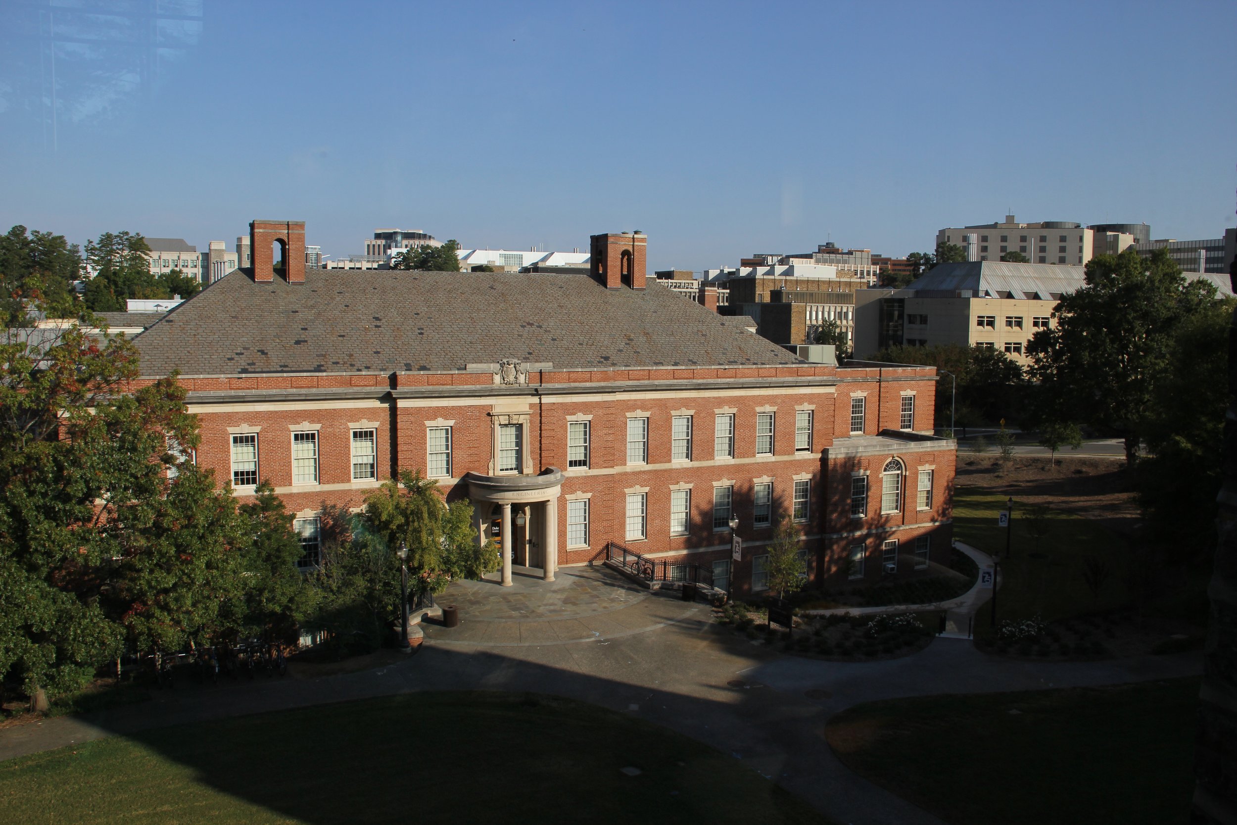
Duke Pratt Hudson Hall is a historic engineering building on Duke’s campus that is undergoing a 2025 renovation and extension project. Our goal was to create a marketing website about the building upgrades that attract donations, sponsors for the new space, and excites the Duke community. As a UI/UX designer, I collaborated with the design director and developers at Duke.
SUMMARY
TIMELINE
January - March 2025
ROLE
UI/UX Design
SKILLS
Visual Design Strategy, Development Handoff, Prototyping / Motion Design
TOOLS
Figma
TEAM
Ian Curran - Design Director, Jenn Dang - PM, Tim Matthews - Front-End Dev
We created an interactive, modern website that bridges the past, present, and future of Duke Engineering, gaining attention of the Duke community.
Design Challenges
Brand extension: Create a bespoke campaign site that works within Duke's existing brand system
Three to four week design timeline: Design and deliver an interactive marketing website showcasing Duke Engineering's evolution on a tight timeline
Multiple stakeholders: Balance feedback from university administration, development team, and Duke faculty with competing priorities
Content management: Build a component library that maintains the design integrity when editors add content, with clear handoff documentation
USER EXPERIENCE AND CONTENT EXERCISES
Identifying content priorities to build emotional resonance among site visitors.
We led workshops with the stakeholders at Duke to determine their priorities, using a similar Duke campaign site as reference.
Key aspects of the homepage:
1. Prominent “Donation” and “Explore the Space” CTAs to direct users to most significant sections
2. Building history/statistics section to show impact of growth
3. Faculty/alumni testimonials and for emotional resonance

VISUAL INVESTIGATIONS & ITERATIONS
The client expressed they wanted this website to bridge the nostalgia of the historic building with the future of the engineering program through this renovation. I brainstormed visual motifs that embody this.
I looked to historical imagery for inspiration, and began to make graphical elements. This sparked the idea of walking into the future through a familiar doorway. I iterated on using minimalist graphics and motion design to capture this effect.
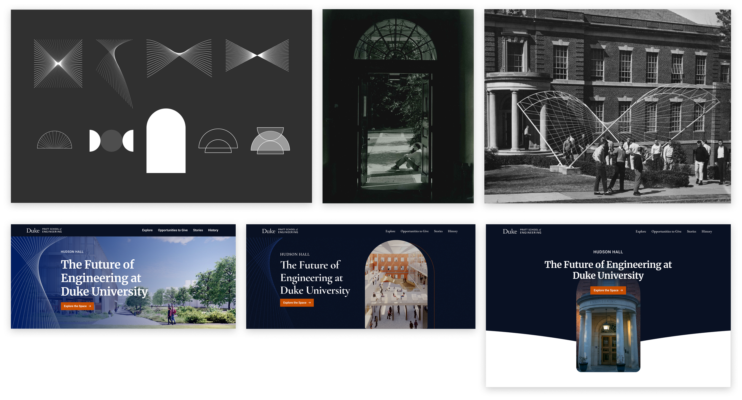
HOMEPAGE ITERATIONS
Defining distinct homepage directions: Airy and Refined to Bold and Layered
Option A, the design I led, is light, sophisticated, refined. It embraces familiar elements such as the archway featured on the Duke Engineering Website.
Option B, created by our senior designer, is bold, interactive, and challenges Duke’s conventions.
Our client preferred the typography and colors of option A with the layering, drop shadows, and interactivity of option B.

Homepage Design
Combining the clients preferred aspects of each direction, I created a homepage design that merges the best of both. An highly interactive, modern site that embraces boldness and elegance, carrying the prestige of Duke.


